click to enlarge
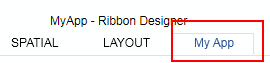
TabPage Container for groups. |
|
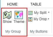
Group Container for controls. |
|
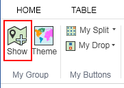
Button / Toolbutton A Button is as simple pushbutton. A Toolbutton is available for mapper windows and allows to create geographical objects. For Togglebutton see Control Properties |
|
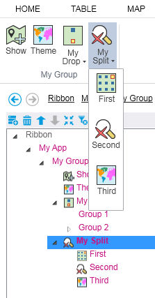
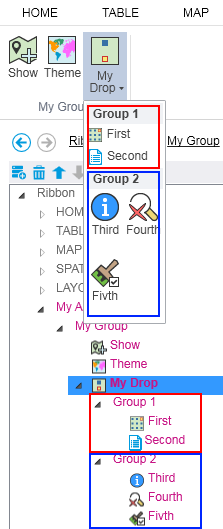
SplitButton / DropDownButton Expandable container for controls. A Split Button has a variable icon depending on the last selected control. A DropDownbutton has one fix icon.
|
|
DropDownMenuGroup Container for controls. Available für SplitButton and DropDownButton |
|
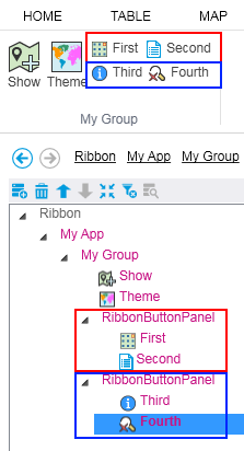
RibbonButtonPanel Container for controls. |
|
Stackpanel Container for controls. A StackPanel on the first level consists of a maximum of two controls, which are arranged one above the other. A Stack Panel on the second level (Stackpanel in Stackpanel) consists of a maximum of two controls, which are arranged next to one another. |
|
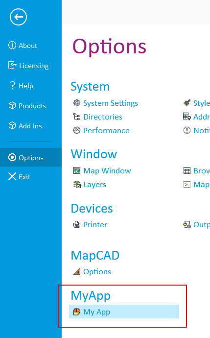
Backstage Even in this area a user defined icon and calling can be used. |
|
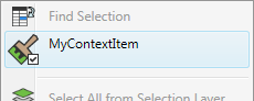
ContextMenuitem see Button/Toolbutton |
|
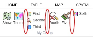
RibbonSeparator The separator is a vertical line separating Controls |
|
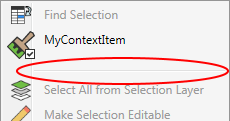
ContextMenuSeparator The separator is a horizontal line separating Controls |
|